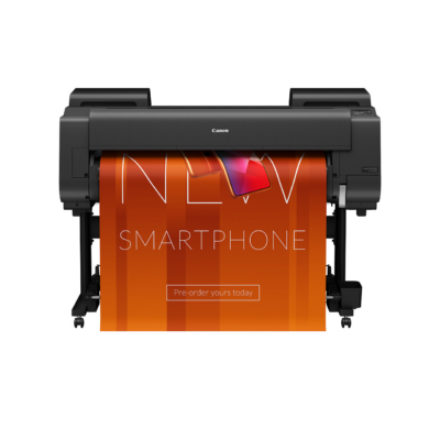
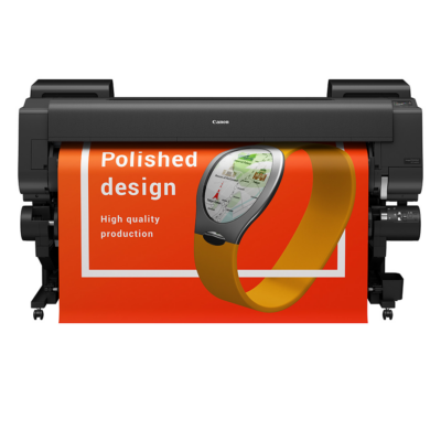
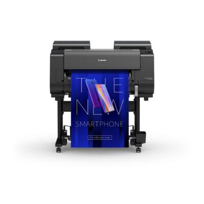
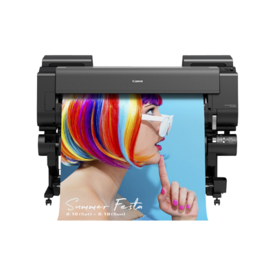
Five design must-dos for large format printing
With high-quality, affordable imaging equipment and design software, it’s easier than ever for “enthusiasts” to take on tasks that were once best left to professionals. But before you try your hand at designing a large format printing project, remember these key factors for ensuring your end result looks amazing.
USE VECTOR GRAPHICS
If you’ve used a computer, you’ve encountered pixel-based bitmap graphics such as JPG, GIF, and PNG files. They’re great for many uses—just not when you’re designing graphics for large format printing.
Instead, create vector graphics: They’re defined by mathematical equations rather than fixed pixels, so their quality isn’t dependent on resolution (the number of individual pixels per square inch comprising an image). Where a low-resolution bitmap will become blurry and “pixelated” when enlarged, a vector graphic is infinitely scalable without sacrificing sharpness. An added bonus, vector file sizes are typically smaller than equivalent bitmaps.
WORK AT SCALE
Make sure you’re working at 100% scale in your design app: If you’re designing a 36” x 48” poster, your file’s print size should be 36” x 48”. Not working on a 48-inch monitor? Simply reduce the image’s magnification on screen to suit your needs. This may seem like an obvious step, but confirming that you’re working on a full-size file reduces the chance you’ll send a too-small design to print.
AIM FOR HIGH-RES
If you need to add photos or other non-vector images to your project, then it’s imperative that these components are at least 120 dpi at 100% scale or you may see pixelization. You may be able to get away with a lower resolution for signs that will only be viewed from a distance, since detail isn’t as important. But try to stay above 75 dpi if possible.
LET IT BLEED
Page bleed refers to an image that goes right to the edges of the paper. If that sounds like your project, you’ll want to allow for at least 3 millimeters of bleed all the way around your page—to account for printing and cutting variations. Keep any graphics and text out of the bleed area to ensure it doesn’t get trimmed from the final product.
STRIKE A BALANCE
Achieving a balanced look for your project is arguably more important than any single text or graphic element you might put on it. Banners, posters, and other large signs typically only have seconds to convey information and leave an impression on a viewer. So, when it comes to…
Graphics:
Limit their number and complexity, so they can be absorbed at a glace.
Maintain a good amount of space around them.
Text:
Keep it minimal and to-the-point, whenever possible.
Stick to sans serif fonts for readability, ensuring letters and words don’t look jumbled together.
Colour:
Use a simple, striking colour scheme (two to four colours max, if you can help it)
Choose a background colour that contrasts with your text and graphics
The gist? Keep it simple—and trust your instincts. If your project looks cluttered and is difficult to process, it probably is!